What is a landing page?
Natalie Ediger, July 29, 2020· Marketing

Anyone who is active in online marketing and did not exactly fall off the moon has certainly stumbled across the term “landing page”. But what is a landing page actually? What distinguishes it from the ordinary website? And why is it important? Stay tuned, in this post we address exactly these questions.
Definition
So what is a landing page? A landing page is a stand-alone website, on which visitors “land” on and should be able to get directly to a certain offer without detours. This means that a landing page is similar to a normal web page, with the difference that we only have a single focus and a clear conversion goal.
The landing page has a clear “call-to-action” that motivates the user to take the desired step. These can be various actions such as registering for a webinar, an e-book download, a product purchase, etc. This call-to-action should be presented as clearly and distraction-free as possible. So in short, a landing page has one single goal: customer acquisition. And that’s it.
How does a landing page work?
Since a landing page serves the purpose of generating leads, we’re usually aiming for one thing particularly: the e-mail address of our visitors. After all, we want to stay in contact with the user in the future and make him or her our customer. For this reason, a landing page usually has a form in which the user’s information, e-mail, telephone number and/or address are recorded. After filling out the form, the user usually receives an e-mail with the desired content or more information. This is also known as a so-called “conversion path”:
For example, the user reaches the landing page through a CTA in an advertisement, fills out a form and receives the offer. Finally, the visitor is redirected to a thank you page. The following is an example of Hubspot and Unbounce:
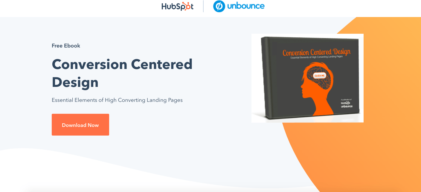
At first glance, the site directly presents a “call to action” with which you can download a free e-book. If you click on the button, a form opens:
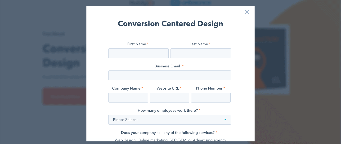
If you need more information about the e-book, you can simply scroll down:
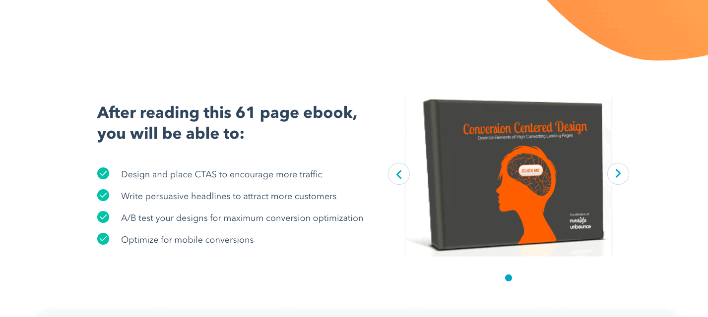
The landing page focuses on one product and does not contain without a navigation bar, which would distract from the actual action (the download). By the way, this registration form should not be confused with a simple subscription e.g. on a blog. Although the visitor usually enters his or her data there as well, the aim of a blog post is merely to inform the reader. Landingpages, on the other hand, are designed to allow the conversion or exchange of a visitor’s information against the offer of a company.
It is also important to understand that the landing page is not part of the company’s website, but a separate page. Although the landing page may be registered under the domain of the homepage (e.g. at www.homepage.ch/landingpage), it is generally not accessible via the navigation menu of the web page, but from other distribution channels such as YouTube, Facebook, via an add-in, the search engine or an e-mail campaign.
The difference to a homepage
So why did the marketing specialists or tech savvies (or whoever was responsible) come up with this fabulous landing page? Don’t we already have enough business vocabulary in our marketing glossary?
As with many things in life (apart from the presidential election in 2016), there is a very simple explanation for this: a normal company homepage simply doesn’t serve the same purpose. A homepage contains a lot of information to introduce the company and its various services. However, this makes it more difficult to motivate the visitor to take a single action. The more options you offer, the less likely the visitor will be able to make a decision. This is also known as “decision paralysis”. A (good) landing page, on the other hand, is designed for a specific target group and a special advertising measure and therefore does not distract from this action by other information.
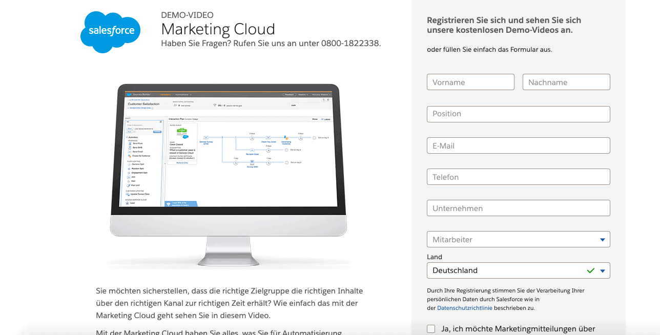
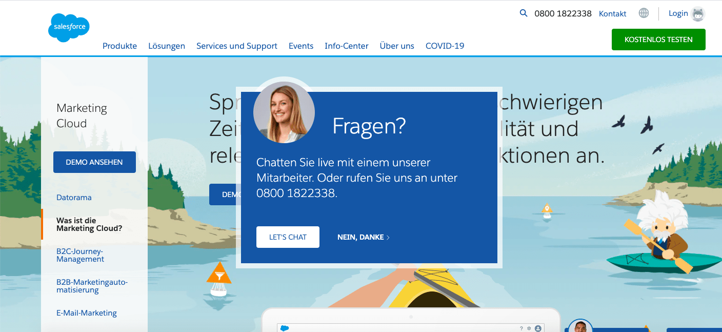
To make the theory a little bit clearer, here is a direct comparison of Salesforce for their marketing cloud.
On the landing page you can register directly for the demo version of Marketingcloud. If you scroll down, there are more details about the product. Besides that, there’s no additional information to get distracted by.
:
Although the actual webpage also contains a button for the demo version, the page contains a lot of other information that would easily distract from the actual goal.
Salesforce also offers a variety of services for different industries, a huge “about us” page, and even eleven sub-sections on the topic of “Covid-19”. Good for introducing the company to the visitor. Bad for converting.
Do you really need one?
Good question. Actually, you don’t really need one. In fact, ideally you need several of them! Studies show that companies with 40 or more landing pages generate about 120% more leads than companies with “only” five or even fewer landing pages.
A correctly designed landing page offers primarily one advantage: a clear and simple focus – and thus a targeted approach to customers and interests. For this reason, a landing page also enables much higher conversions than a normal web page, which is almost overflowing with information. And you surely like conversions, don’t you?
In the following an overview about some of the advantages:
Through a clear and easily recognizable call-to-action we can interact directly with the user. The less distraction caused by missing buttons allows the user to make better decisions – and thus offers more downloads for your e-book, registrations for your webinar or newsletter or product sales.
With the help of topic-relevant keywords, landing pages enable a higher ranking for search engines and therefore more traffic. Of course, SEO efforts should not be neglected for this. The more landing pages you have, the higher is the probability that a user will find you with the help of the search engine and thus enter his contact details directly. Lead generation check ✅.
A landing page makes it possible to segment according to specific interests and needs and thus address the target group with relevant offers. Again, the more landing pages you have, the more specifically you can identify different personas.
With its minimalist design, a landing page conveys the main message in a clear, concise and quick manner – before the visitor loses attention. Don’t forget, we live in the age of stimulus satiation and have an attention span of only 8 seconds.
Of course, not everything is rosy. A landing page is no guarantee for wealth and success. It is doubtful whether or not it will even give you the paycheck for the next car maintenance. So if you expect enormous conversions and magical turnovers, you should get back down to earth. Miracles and magic may exist in the Wizards of Oz, but not so much in marketing. In fact, the average conversion rate of landing pages across different industries is just 2.35%. Why do I still value the landing page? Because the landing page offers a lot of potential, as long as it is designed correctly and does not lose sight of the actual goal.
Almost every online company uses landing pages today. But using them is one thing, using them effectively is quite another. The top 10% of companies have conversion rates that are about 3-5 times higher than the average. Conversion rate experts were able to generate $1 million in annual sales for Moz with the help of an optimized landing page and an e-mail promotion. And that already sounds relatively promising, doesn’t it?
But what does it take to create an effective landing page that helps you achieve your conversion goals? Well, stay tuned! Because in our next article we will share with you all the details it needs to convert and how you can create one by yourself 😉
