Website ideas and inspiration
Marc Bachofner, June 30, 2021·
Creating a webpage is not everyone’s cup of tea. But often you just can’t avoid it – because a successful brand without an online presence is hardly imaginable nowadays.
However, a webpage should by no means simply be a boring presentation of dry facts, but rather put your brand in the spotlight. How to do that? Keep at it, because that’s what you’ll learn in today’s article. Here are the website ideas and sources of inspiration that will make your webpage stand out from the competition.
11 website ideas for a successful brand presentation
Animation
What would a modern webpage in the digital age be without some animation? Animated elements draw the eye and give your page that certain something. Of course, 3D animation is especially popular – it feels close to reality and can really create a breathtaking experience when used correctly.
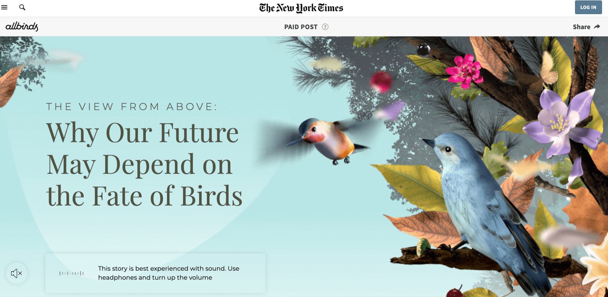
Allbirds, for example, a sustainable US shoe brand, demonstrates how it contributes to environmental protection by manufacturing its shoes in a sustainable way. The animated 3D effects are a real eye-catcher. The additional chirping of birds quickly gives you the feeling of being in a fairytale world – which also leads us to the next point.
The additional chirping of birds quickly gives you the feeling of being in a fairytale world – which also leads us to the next point.
Sound design
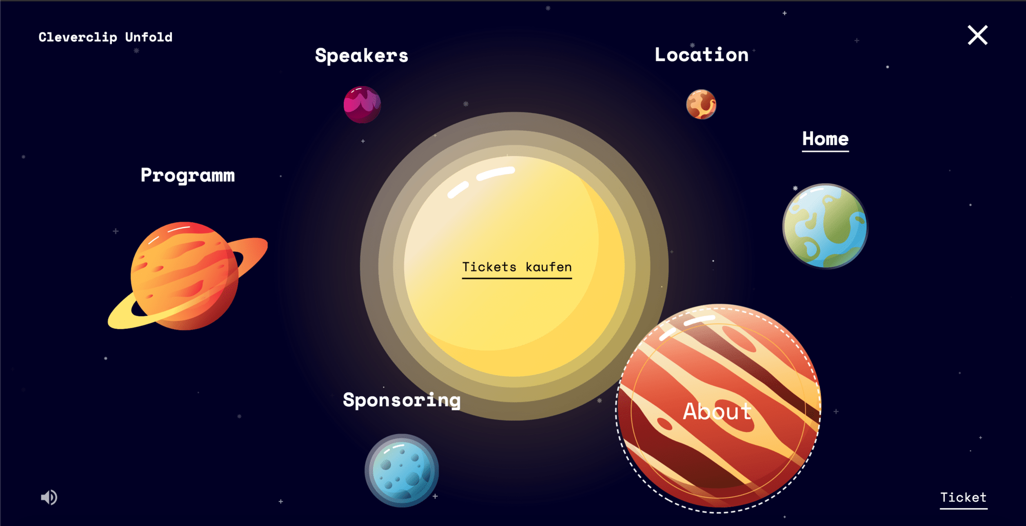
Music is not only important for a blockbuster. It can also emphasize the message on a webpage, creating a much stronger emotional connection between brand and audience. And I’m not just talking about background music here. After all, it’s always the little things that you measure. Particularly exciting are unexpected musical interactions that sound, for example, during a mouseover or text input. We have taken this aspect into consideration for our Unfold webpage and have thus incorporated various sound elements. And you have to admit that without this musical background the journey into the universe would only be half as exciting… .
Explainer videos
Video content is particularly effective at getting a message across. An explainer video gets to the heart of even complex content in the shortest possible time. But not only that! Visual storytelling is generally considered the fine art of marketing. Our brain does not remember everything, but only the most important things. Especially events that move us emotionally are stored particularly well in long-term memory due to the development of certain neurotransmitters in the brain. And storytelling videos allow us to do just that! Here is an explanatory video that adorns Crossiety’s webpage:
Interactive elements
Interactivity is the new must-have in marketing. Because we live in an age of sensory overload and it is becoming increasingly difficult to capture the attention of users.
With interactive content, however, you stay in the fast lane – here, the viewer becomes part of the experience himself and is actively involved in the content. There are different ways to do this. For example, you can include a quiz on your webpage, scrolling effects, or create the entire page as an interactive infographic.
Right at the beginning of the article, I showed you an example from Allbirds – although there the focus is more on the three-dimensional design, the scrolling effect also enables a much higher interaction with the audience. At Cleverclip, we included a globe for our Unfold event that actually “unfolded” to reveal more and more information.
Illustrations
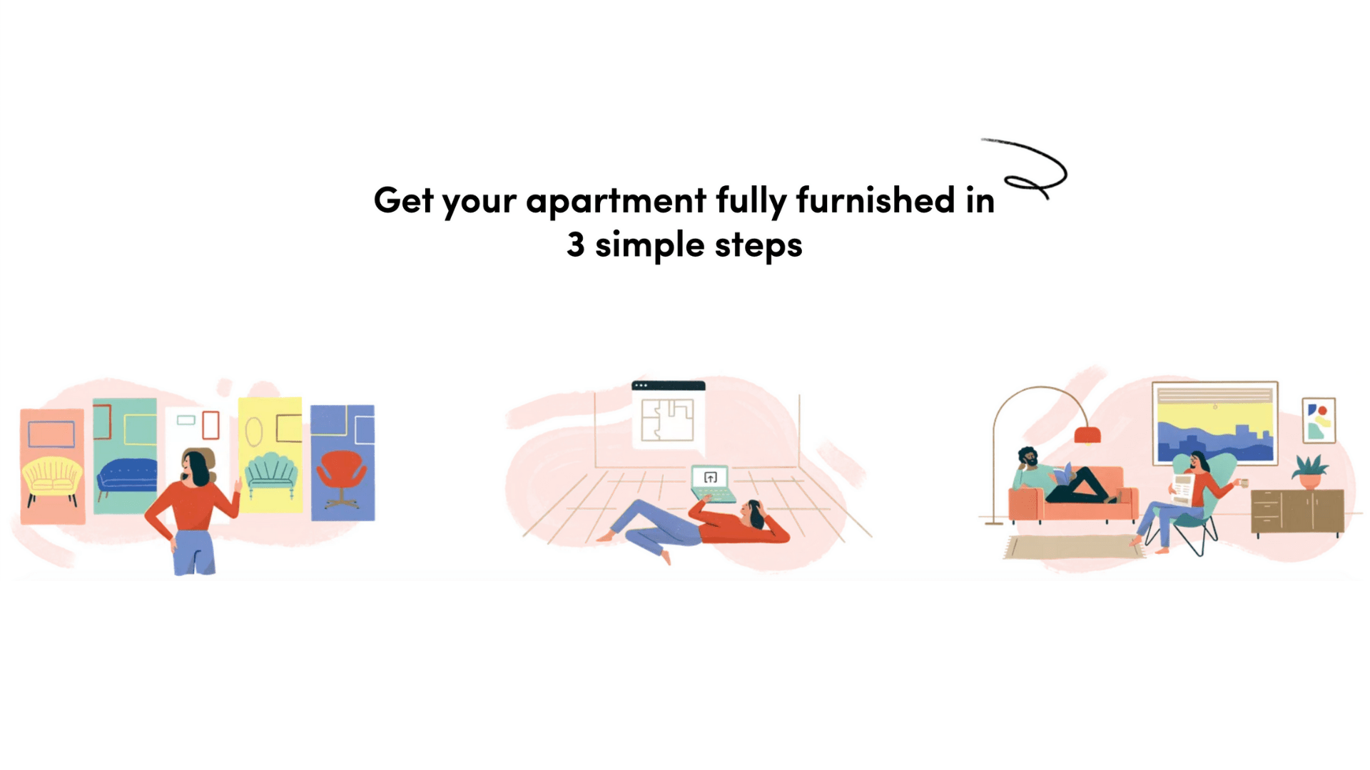
Please do not use stock images! Believe me, most of us know the database of (at least free) stock image providers pretty much by heart and therefore know exactly when the webpage designs come from there. Rather use individual illustrations to give your webpage a playful flair and create an interesting variety. Even small illustrations that serve only as decorative elements are enough. We had the opportunity to do just that for the Pabio furniture subscription. In some places, we even animated the illustrations.
Javascript Frameworks
Here is a point that is perhaps less visible to the user, but is especially beneficial to the developer of the webpage: the Javascript frameworks. The term “framework” comes from the field of software development. It is a kind of pre-programming, in which certain functions and elements are already included and for this reason, do not have to be created from scratch each time. So a kind of basic architecture of the software. Such frameworks reduce redundant tasks in web page design and also offer faster loading times to the user.
Cursor design
Even small changes can make a big difference on the webpage, including the customization of the cursor or mouse pointer. For example, this can be animated or replaced by its own element (does not always have to be the classic mouse pointer ;)). Also, the cursor can be customized to specific content.
Color blocking and neon colors
Have the courage to use color! While black and white designs are classy classics, sometimes you need to step it up a notch to stand out from the crowd. Color blocking or neon colors (or both combined), can give your brand that decisive kick.
Minimalism and CTA buttons
Back from the color universe to planet earth. Sometimes less is more. Depending on the brand message and target audience, it can make sense to keep the page as minimalist as possible and simply place a highly visible “call to action.” Ultimately, the goal is to sell the product or service – so a simple uncluttered page without a lot of distractions can serve just that purpose. But beware, minimalism doesn’t mean boredom. Above all, pay attention to linguistically meaningful text design that compensates for the plain webpage style.
Varied forms
For lead generation, it is necessary to integrate a form. The problem with this? Only very few users like to fill out such a form. So it should be designed as inviting and creative as possible. Here, as always, there are different options. Instead of a regular form, for example, you can create a cloze or split it into different pages so that the user can click through as part of an interactive experience. Then it will also look less oppressive. Here is an example of how we did it with Pabio:
Speaking of which, please only ask for the most important information in the form. Otherwise, you will unnecessarily drag it out and, in the worst case, lose the user’s interest.
User Experience for Developers
UX is the be-all and end-all. But not only for the end user. Here I have to smile a little while writing because my colleague Sam and I have talked together about this point a little longer. The conclusion: The use of any webpage should of course be fun for the developer and not become a desperate bug-fixing action. Although a bit different from the previous points, this point should not be missing in our list.
Here, for example, there are programs such as Contentful that make it easier for developers and content managers to use and collaborate with each other, allowing them to work more efficiently.
In this area, the term “headless CMS” is important – here, backend content functions (e.g. the creation and management) are separated from frontend functions (e.g. the presentation and delivery). This is an important prerequisite for content management and thus simplifies the tasks on both sides.
Speaking of UX and performance: choosing the right web hosting provider to ensure stability and speed is a must.
The best sites for web design inspiration
Despite the website tips, you’re still a bit lost and need a little inspiration? Don’t worry, I’ve taken that into consideration as well. Below are some recommended sites that are ideal sources of inspiration for your webpage design.
Dribble
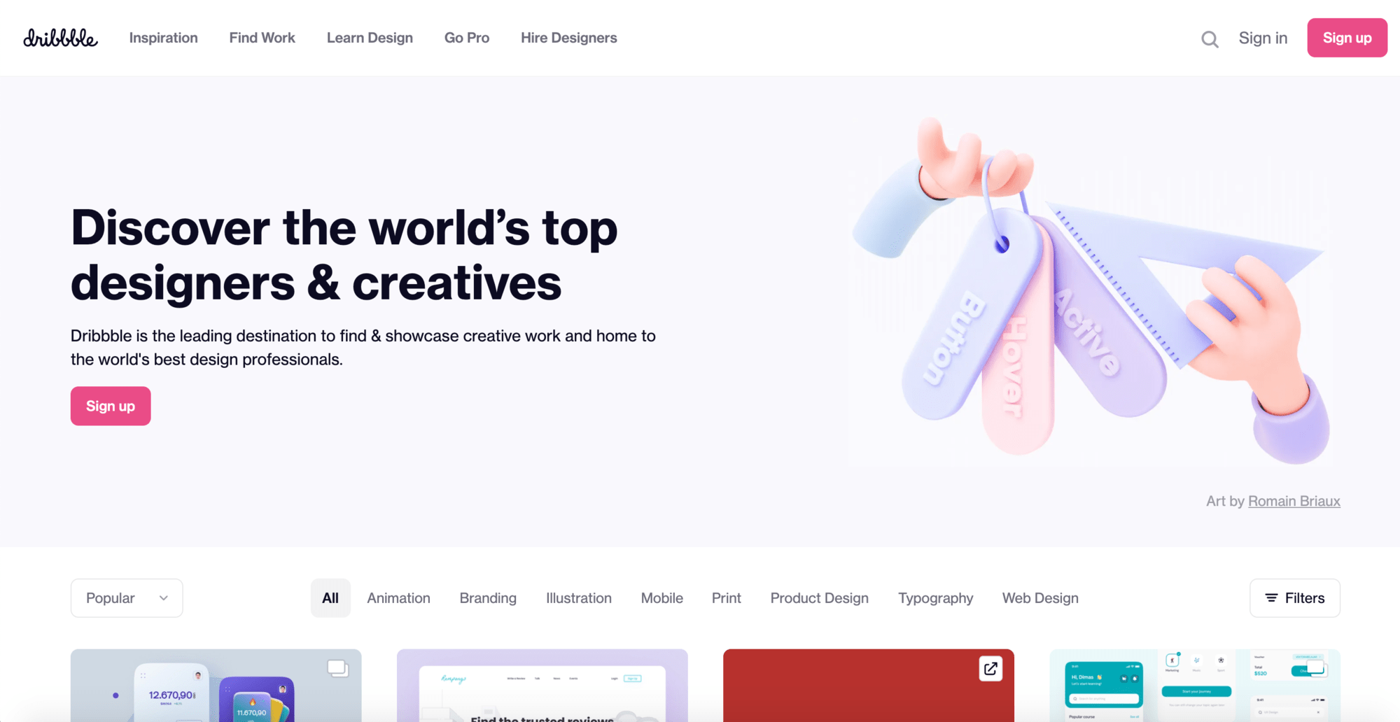
Dribble is a kind of exclusive Instagram for designers or graphic artists from all over the world. Here you can find interesting projects and of course, also present your own work. The principle is similar to Instagram – you can upload a picture with a short caption and follow other users. To become a member, however, you need an invitation and these are limited per user – so the network guarantees only qualitative work. Some marketing is certainly also hidden behind it. Because this principle of scarcity gives the community platform additional hype.
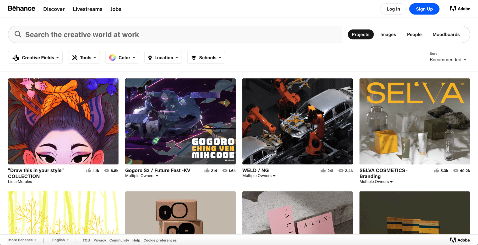
Behance
Behance has been part of Adobe Creative Cloud since 2012. Here, creatives can share their projects as a detailed portfolio and easily share the profile using a URL.
Behance also offers a bit more space in the description than, for example, Dribble. In addition, job postings in the creative area can be found via the “Job” tab. So overall a social media platform that provides enough inspiring web designs and thought-provoking ideas.
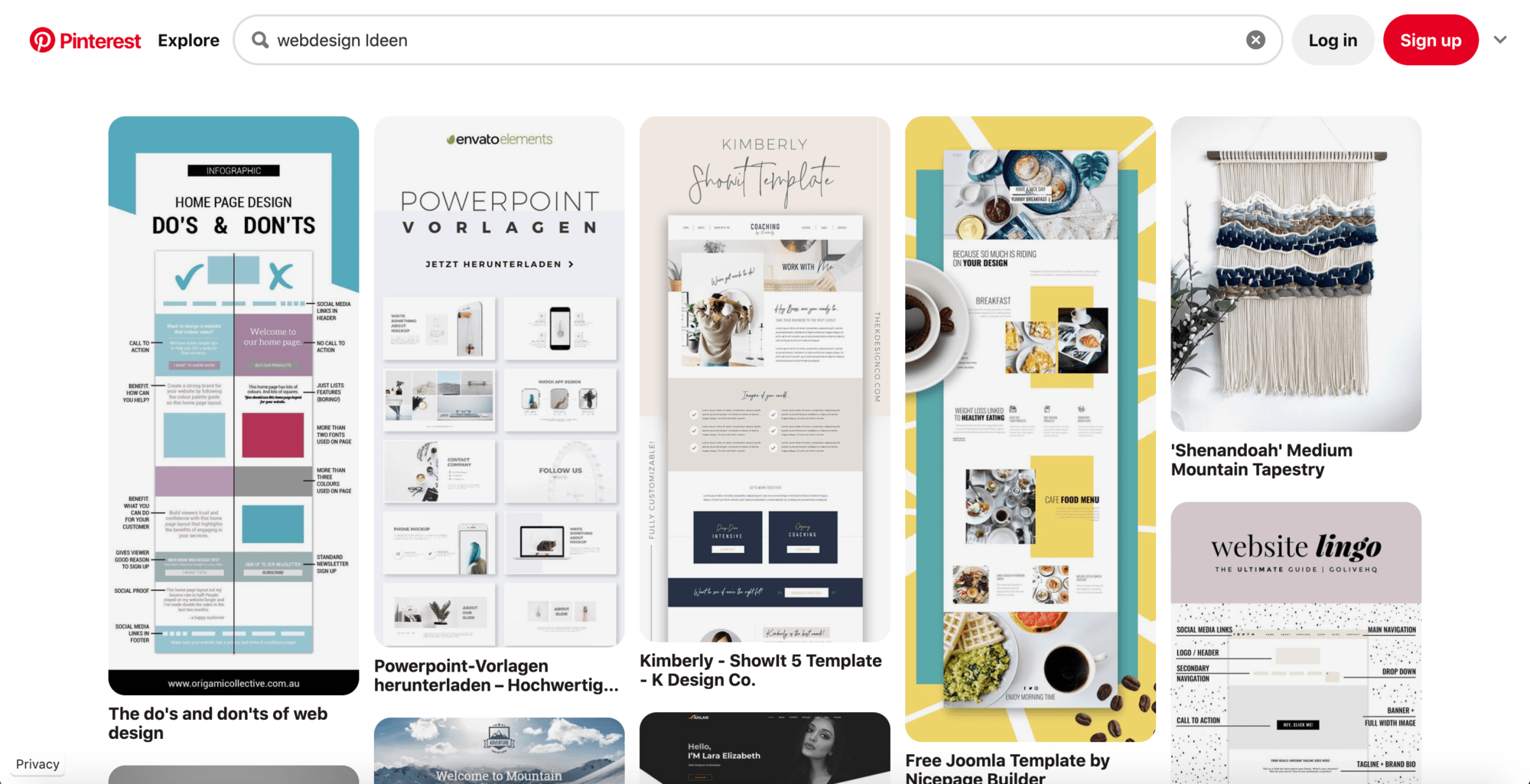
Pinterest Mood Boards
Pinterest should probably mean something to everyone. Unlike the previously discussed sites, Pinterest is a photo platform for everything from home decor to travel photography, inspirational quotes to digital and graphic design.
Using the search function, you can search for specific mood boards – for example, “webpage design” and thus also find a variety of sources of inspiration. You can easily save your favorites and create your own “pin”.
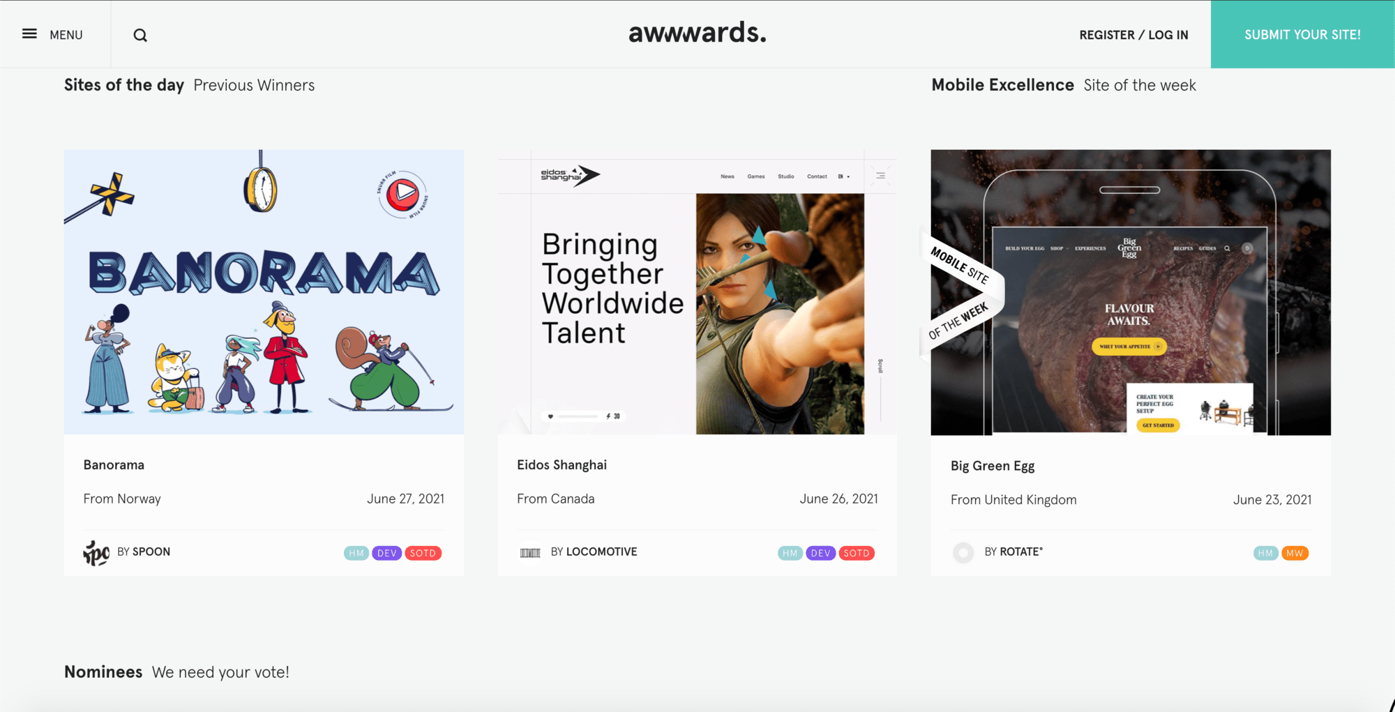
Awwwards
On this platform, you will find the best of the best web designs. Because Awwwards is not only a source of inspiration but also the most visited online award platform in the world. Here web designers can submit their site and then collect points.
All websites with a high score are then displayed under the “Nominees”. The best site receives a “site of the Day” award and is displayed in the header. In addition to the awards, designers can also earn certificates.
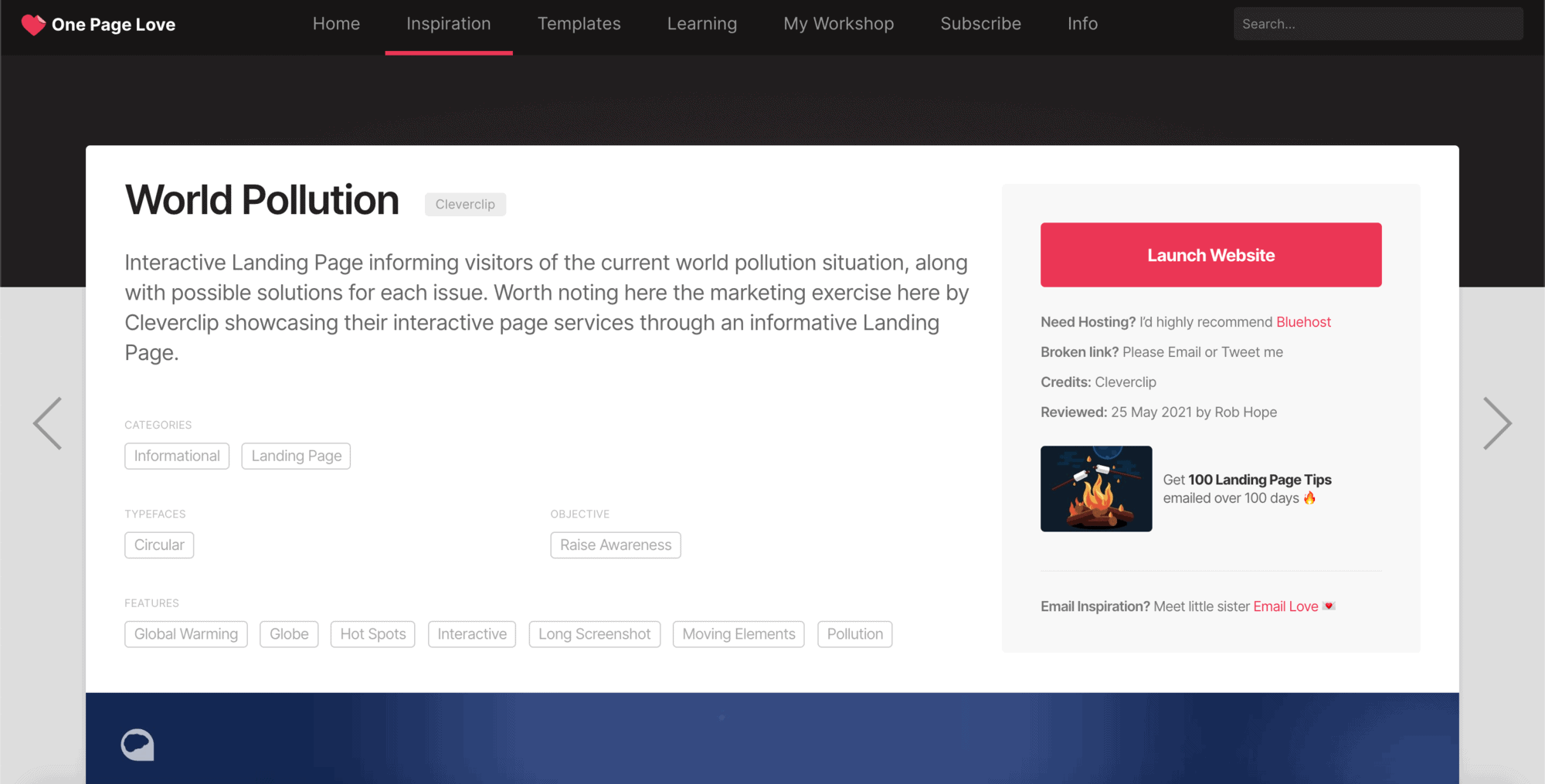
One Page Love
Just like Awwwards, Onepagelove also provides the best pages. Here the focus is mainly on, as the name already says, “One Pagern” and templates. The site is run by Rob Hope, who analyzes webpage submissions. Only qualitative, non-commercial pages are published. Cleverclip is also listed on this page with the World Pollution project:
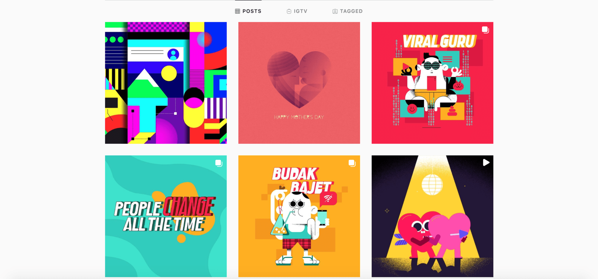
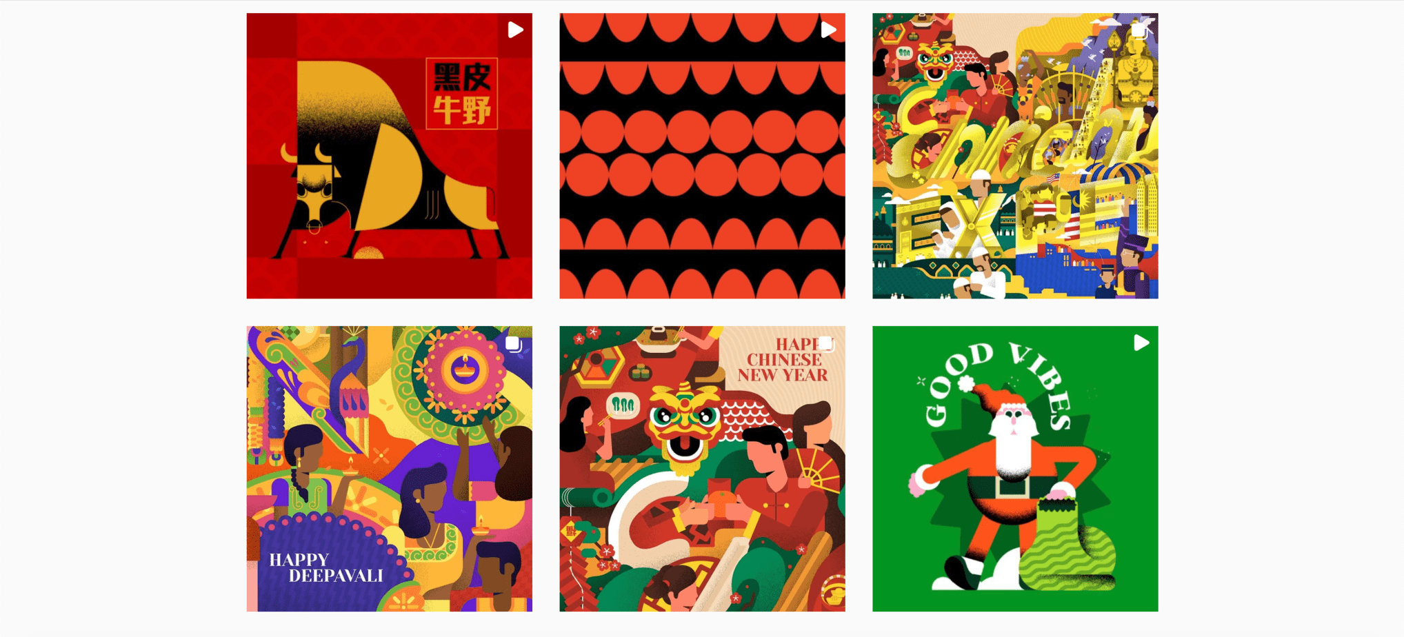
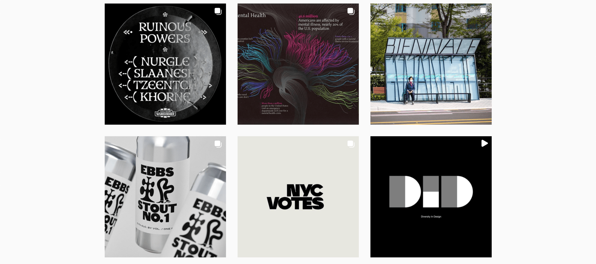
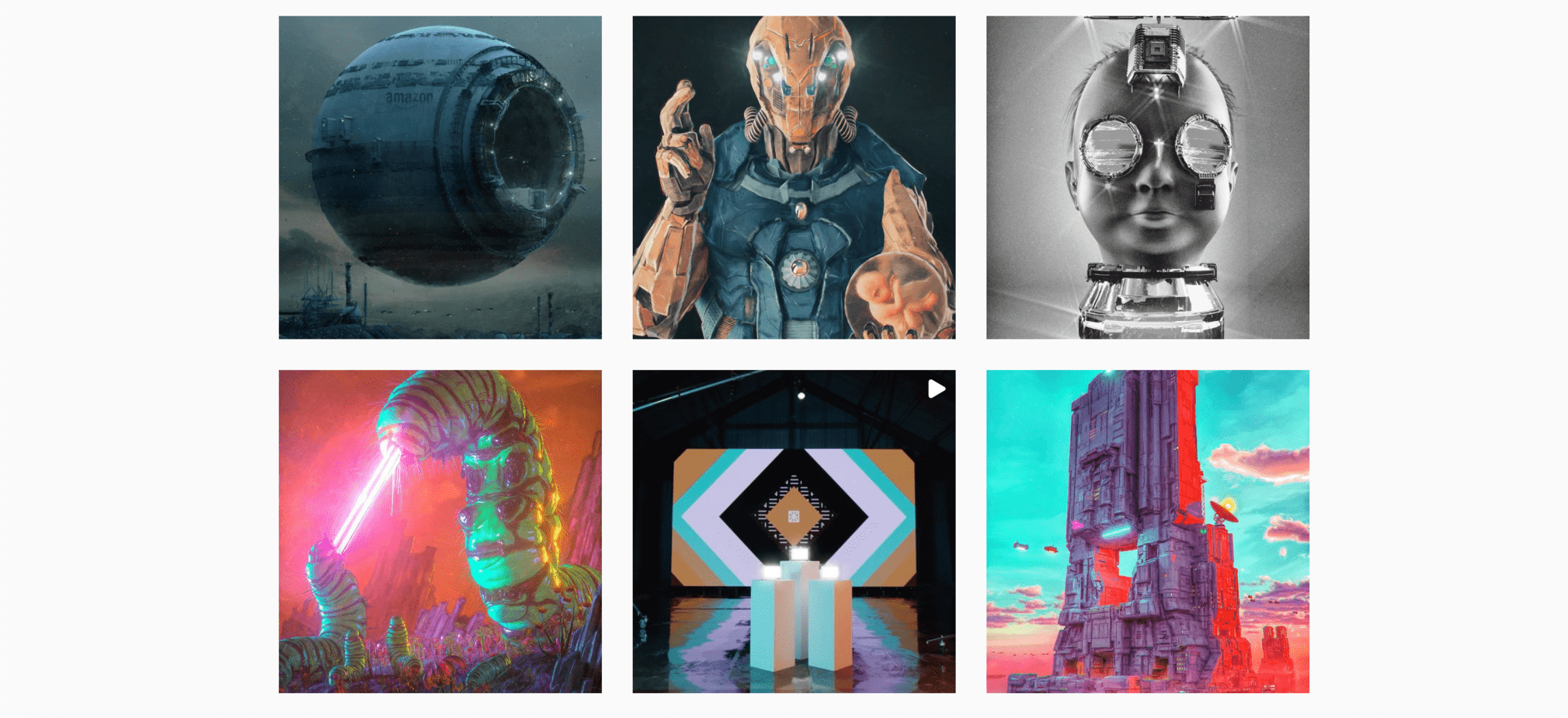
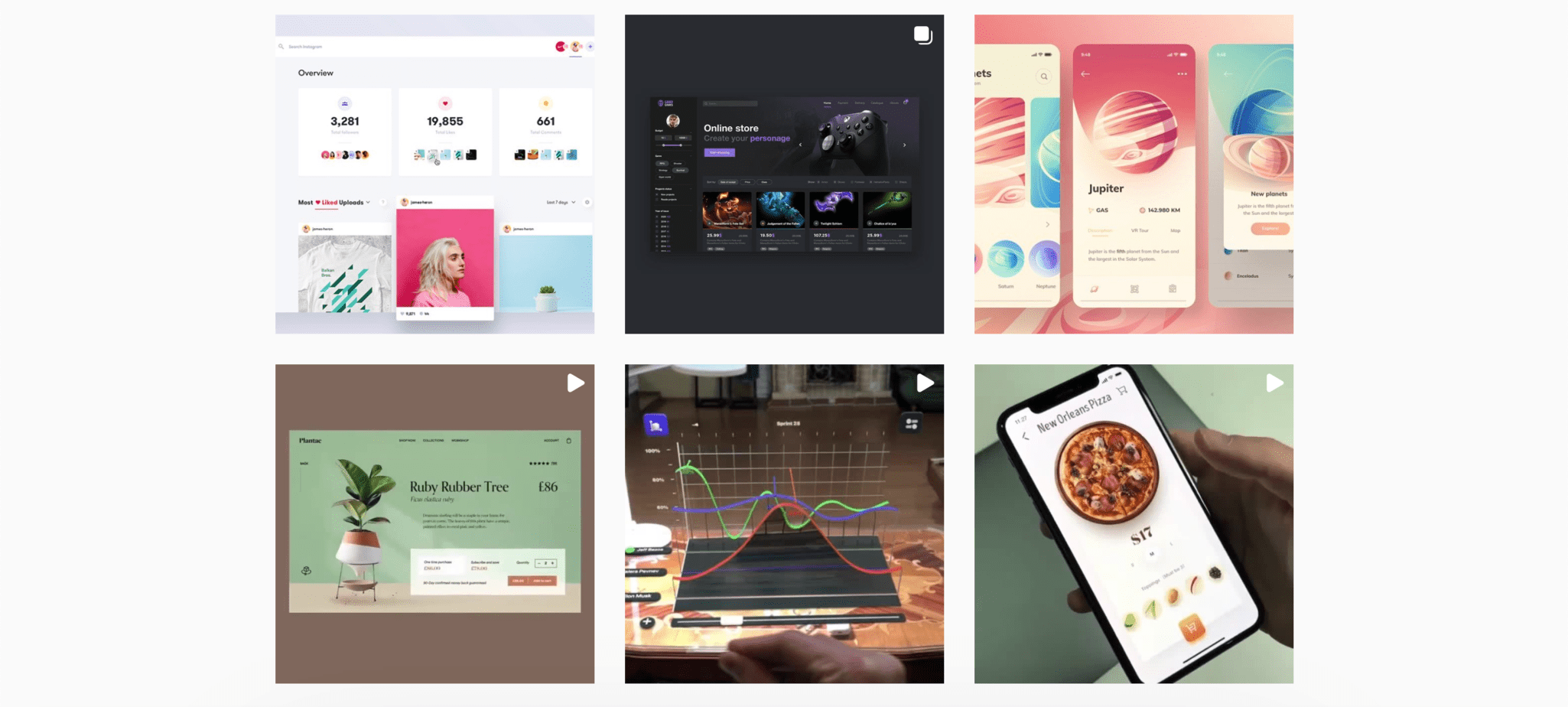
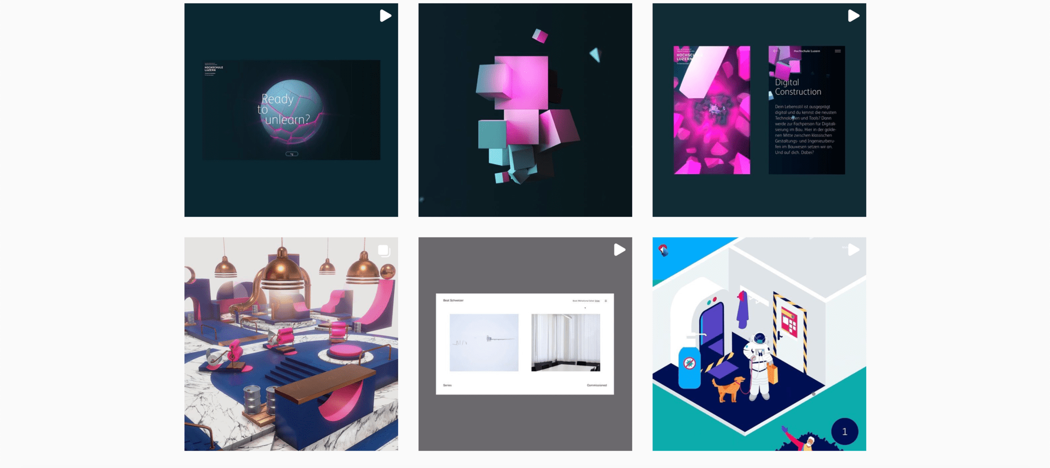
Yes, Instagram should not be missing either. Because there are of course plenty of inspiring designers here – you just have to know what you’re looking for. Here are some high-quality accounts in the design field:
A shoutout to my colleague from Cleverclip – Saimen’s creativity definitely deserves some recognition :).
Web design inspiration conclusion
Goodbye boredom – I hope I could inspire you a bit in this article and share some exciting website ideas with you. As you can see for yourself, there are plenty of ways to spice up your webpage a bit and put the brand in the spotlight.
And if you are still not inspired enough, no problem – Cleverclip is at your service. Just contact us and we will create an exciting web design together with you.
