Why Our Stand Looks Like Our Office
Natalie Ediger, May 15, 2017· Cleverclip
sAlu, cardboard walls, system buildings and poorly fitting off-the-shelf suits between two boring roll-ups. The creative spot of colour is a pixelated logo printed on a grey carpet. Well, what does that remind you of? That’s right, your last visit to the fair.
I spontaneously think of only a few things that are more boring than the sadly uniform interior of the exhibition halls in the DACH region. The trade fair stands of large companies worth billions of euros are an exception.
Source: www.doopin.de/2016/ein-messeauftritt-macht-sinn-wirklich.php
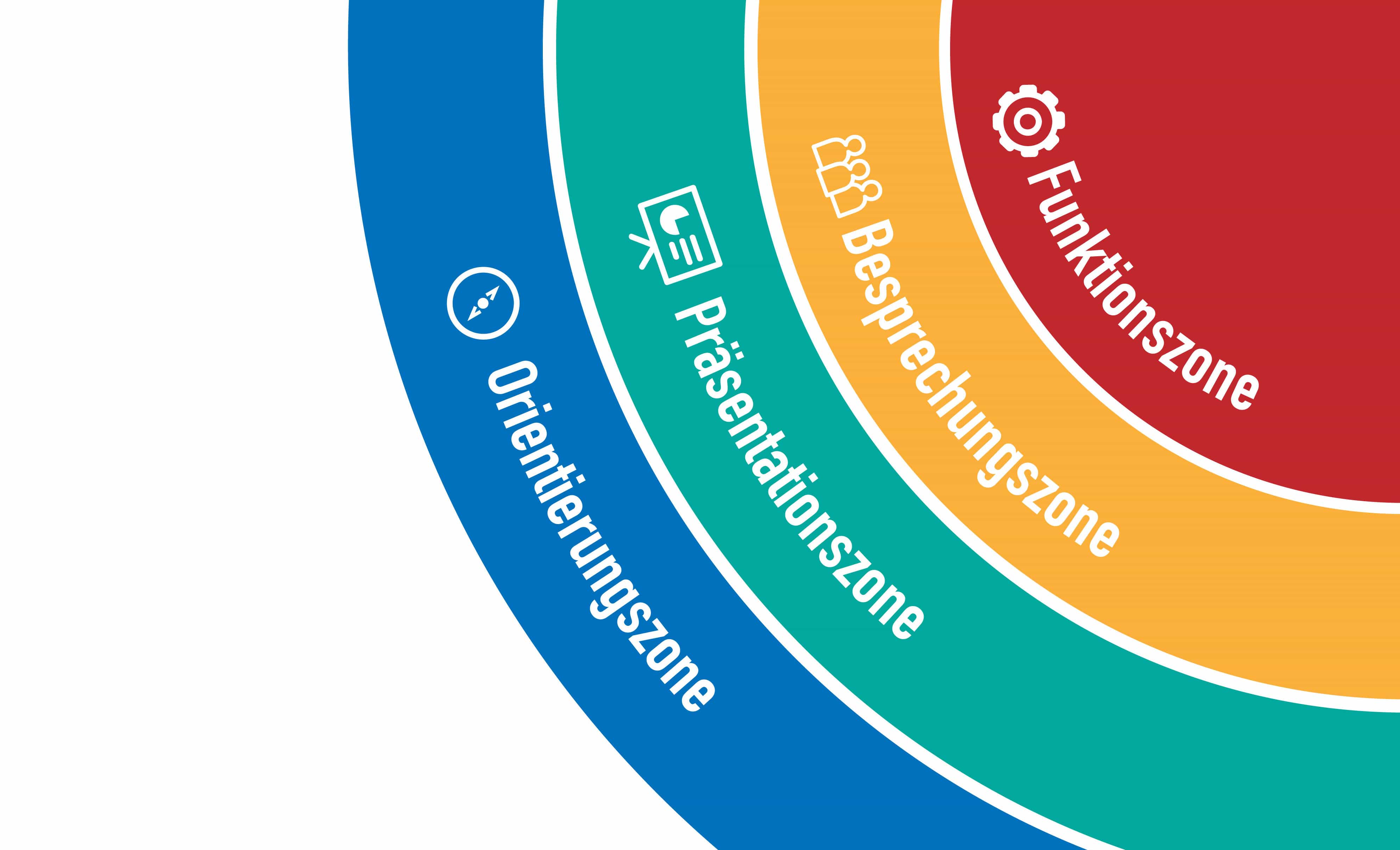
In general, the structure of a classic stand can be divided into 4 areas:
The orientation zone:
This is the outermost area of an exhibition stand. This is where the public can see what is on offer at the stand. If interest is not aroused now, trade fair visitors simply walk past the stand.
The presentation zone:
Directly after the orientation zone, the presentation zone follows. Here the visitor, attracted by the trade fair stand, should be able to inform himself independently about what the respective company offers. This is the time for the consultants.
The meeting zone:
If one of the visitors follows up to this area, more in-depth technical and information discussions will take place. Ideally, there is a seating area and a coffee where the foundation stone is laid for joint projects.
The function zone:
The smallest part of an exhibition stand is the functional zone. This area is not accessible to visitors to the stand. It functions as a warehouse or kitchenette.

From these modes of operation, it is possible to deduce some of the reasons why a system construction stand is out of the question for us and, in my opinion, should not come into question for anyone else.

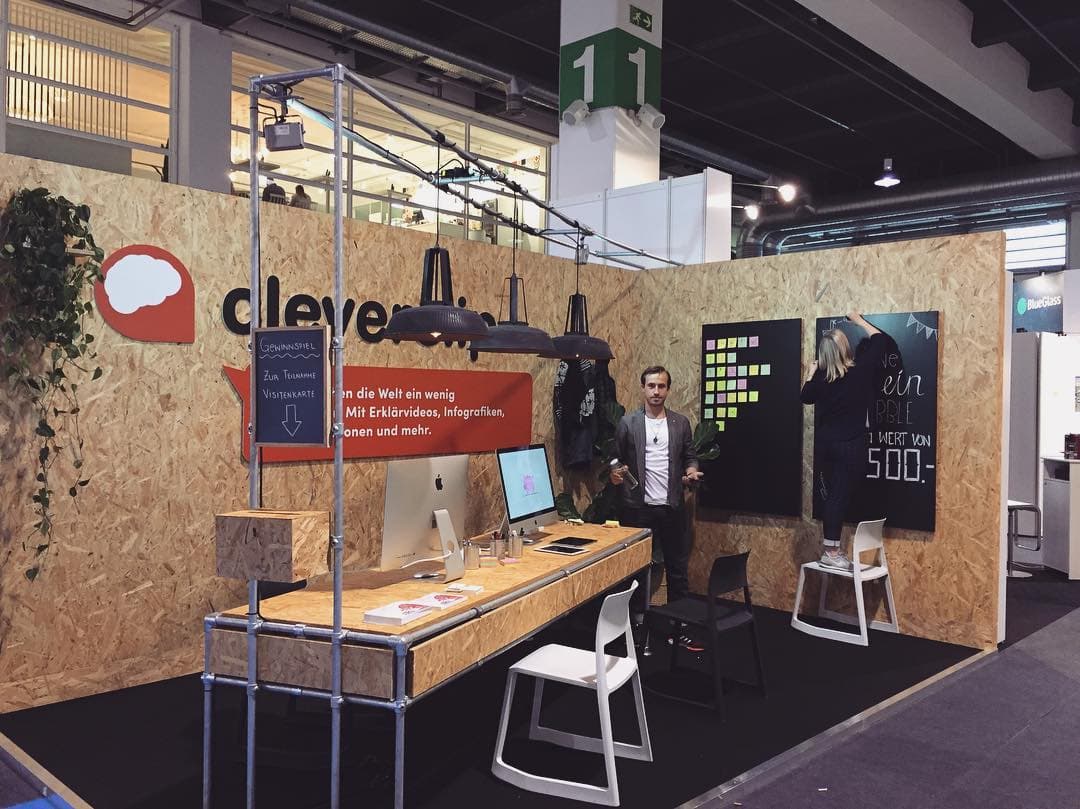
The next drama follows on the foot: The presentation zone. Brochures and roll-ups as information material – who wants to read so much at a trade fair today? The flyer that you take with you ends up in the garbage anyway. Our information material runs as an animated clip on the iMacs on our table, as if someone had just been working on it. To forget that, the visitors would not only have to throw away the flyer, but also their heads.
showreel 2017 from Cleverclip on Vimeo.
Meeting zone? secluded area? with us the visitor sits also at the table. At eye level. And because our stand looks like our office and we behave like it, we transport our vibe and our way of working from the office to our stand, directly into the heads of our future customers.
And if they already have an idea for a project – or want our advice – we take a few post-its and get started. Simple and uncomplicated. As in real.
Certainly not every office is suitable for rebuilding it as a trade fair stand – or some offices look exactly the same as their system construction stands. I’m sorry about that.
But we do – and we also transport that through our office and trade fair stand furnishings – attach importance to design, quality and individuality.
Interested in more news, tips and tricks about explanation videos and the daily work at Cleverclip? Well then off to our newsletter or our trade fair stand, for example at the DMEXCO in Köln.